By Adam Pagnucco.
Now let’s look at wage and salary employment. Statistics on this measure have garnered some negative headlines for Montgomery County over the years. Most studies examine data from the U.S. Bureau of Labor Statistics, which has a continuous series for counties going back to 2001. Today we are going to examine a series from the U.S. Bureau of Economic Analysis, which goes back to 1969. Since the latter agency employs data from the former agency as an important source, the two should track each other in broad terms.
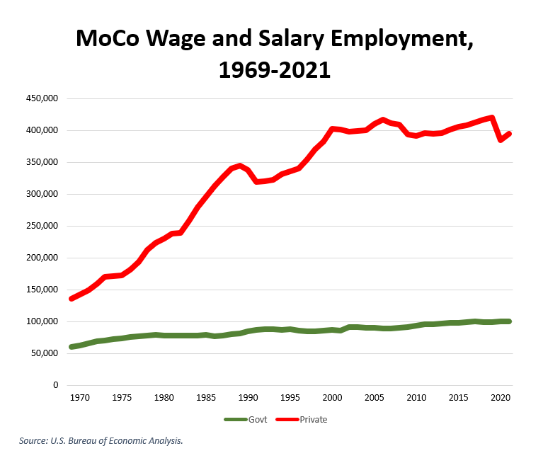
Let’s start with some history. The chart below shows private and government wage and salary employment from 1969 through 2021. Private employment responds to the business cycle, dipping during recessions and surging during upturns. Government employment is more of a steady Eddie since federal spending grows continuously. Thank God for the feds!
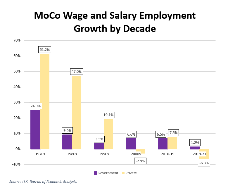
Now let’s look at the growth of government and private wage and salary employment over the decades. From the 1970s through the 1990s, job growth was driven by the private sector. Since then, government has sometimes grown faster than the private sector. Our taxpayers pay for state and county government jobs, but most of the cost of federal jobs is paid by taxpayers from other places. This is one of those times when it’s good to be MoCo!
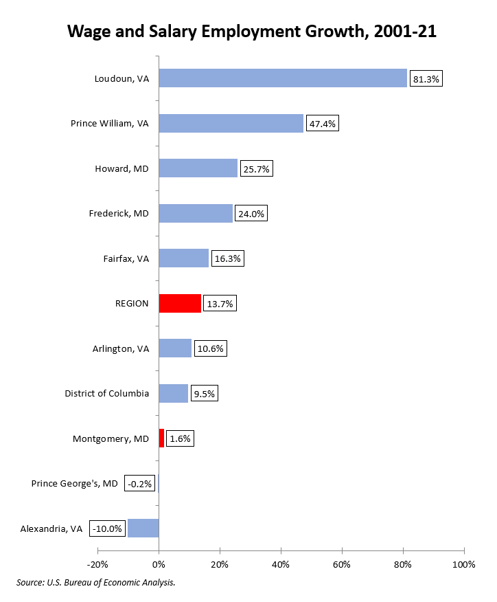
The chart below shows wage and salary employment growth over the last twenty years. We lag the region but we are not the worst performer.
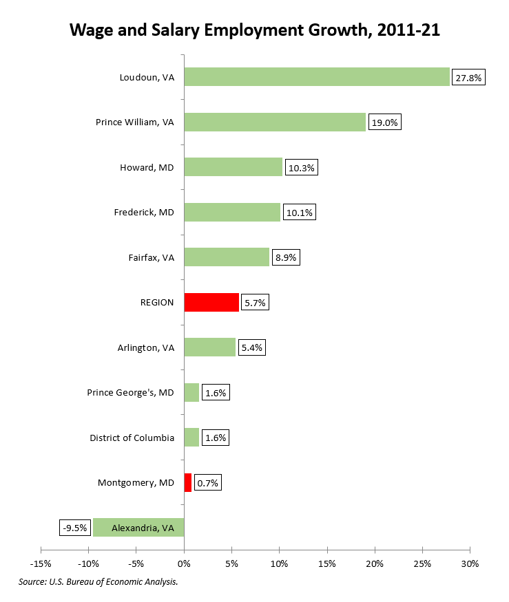
Now let’s look at the last decade. At least we are not Alexandria!
Finally, the chart below shows 2019-21, the early part of the pandemic. Yes, we had losses, but so did everyone else and we do not stand out.
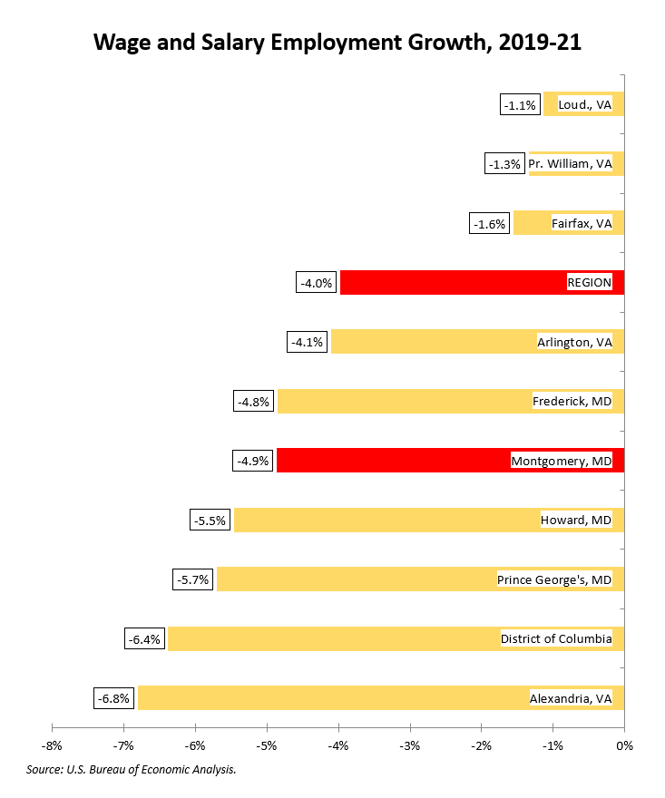
Everyone in the region – not just us – now has to dig out from the pandemic. We had slow job growth after the Great Recession when normally upswings in the business cycle produce surges in jobs. Our post-pandemic rate of job creation has huge importance for our county budget and our quality of life.
Next: a look at average wages.