By Adam Pagnucco.
Part One introduced the topic of whether MCPS students and staff feel safe at school. Part Two looked at racial data of students and staff. Part Three examined individual middle and high schools from the perspective of students. Part Four examined individual middle and high schools from the perspective of staff. This part will look at patterns of student responses for middle and high schools.
MCPS’s Schools at a Glance series includes demographic data on schools. Downloadable spreadsheets for this data are available for the 2022-23 school year. Some of this data correlates with student responses on safety. The following charts illustrate a few of these correlations.
The scatter chart below shows the percentage of students who did not feel safe (vertical axis) and the percentage of students who received free and reduced price meals (FARMs rate, horizontal axis) for middle schools. The red dashed line is the line of best fit, which summarizes the relationship between these variables.
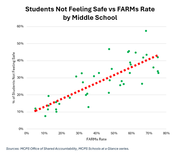
See the upward slope of the line of best fit? These variables have a positive correlation. Another way to summarize their relationship is with a correlation coefficient, which measures the correlation between two variables. A correlation of +1.0 is a perfect positive relationship between the two while a correlation of -1.0 is a perfect negative relationship. The correlation between students feeling unsafe and FARMs rate in middle schools +0.80, which is a strong positive correlation.
Let’s look at another relationship. The scatter chart below shows the percentage of students who did not feel safe (vertical axis) and the percentage of students who were White for middle schools (horizontal axis). The red dashed line is the line of best fit, which summarizes the relationship between these variables.
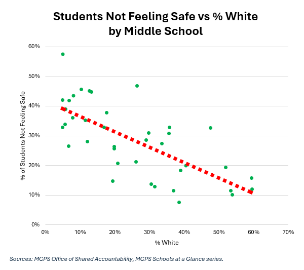
In this case, the line of best fit has a downward slope. The correlation coefficient between these two variables for middle schools is -0.70, which is a strong negative correlation. This tracks with the data shown in Part Two, in which White students were more likely to feel safe at middle schools than most other students.
Now let’s look at high schools. The scatter chart below shows the percentage of students who did not feel safe (vertical axis) and the percentage of students who received free and reduced price meals (FARMs rate, horizontal axis) for high schools.
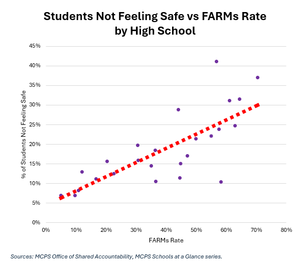
As with middle schools, these two variables have a positive correlation. The correlation coefficient of the two is +0.75, a strong positive correlation.
Let’s look at another relationship. The scatter chart below shows the percentage of students who did not feel safe (vertical axis) and the percentage of students who were Black for high schools (horizontal axis).
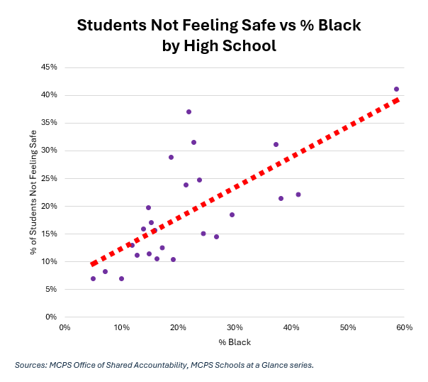
The correlation coefficient of the two is +0.70, a strong positive correlation.
Finally, the scatter chart below shows the percentage of students who did not feel safe (vertical axis) and the percentage of students who were White for high schools (horizontal axis).
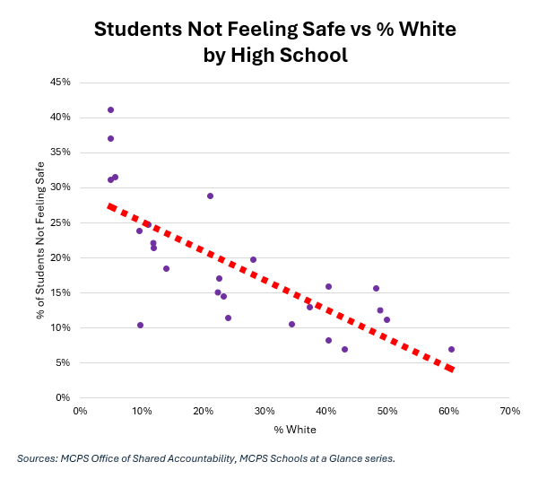
The correlation coefficient of the two is -0.75, a strong negative correlation.
What we see in the student surveys are strong correlations between economics and (some) racial variables and feelings of safety. Does this hold up in the staff surveys? We will find out in Part Six.