By Adam Pagnucco.
Part One introduced the topic of whether MCPS students and staff feel safe at school. Part Two looked at racial data of students and staff. Part Three examined individual middle and high schools from the perspective of students. Part Four examined individual middle and high schools from the perspective of staff. Part Five found correlations between economics and some racial data and student responses on safety in middle and high schools. This part will look at patterns in staff responses on safety.
In MCPS’s FY24 survey, staff were asked, “How safe do you feel in your school?” Allowable answers were extremely, quite, somewhat or not at all. We correlated the combined “somewhat” and “not at all” responses with demographic data on middle and high schools for the 2022-23 school year.
The scatter chart below shows the percentage of staff who feel somewhat or not at all safe (vertical axis) and the percentage of students who receive free and reduced price meals (FARMs rate, horizontal axis) for middle schools. The red dashed line is the line of best fit, which summarizes the relationship between these variables.
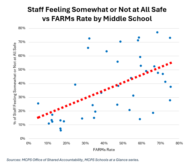
The line of best fit slopes upward, indicating a positive relationship between these two variables. The correlation coefficient of the two is +0.55, showing a moderate positive correlation.
Let’s look at another combination. The scatter chart below shows the percentage of staff who feel somewhat or not at all safe (vertical axis) and the mobility rate for middle schools. MCPS calculates mobility rate “by dividing the sum of entrants and withdrawals by the average daily membership.” Essentially, this is student turnover.
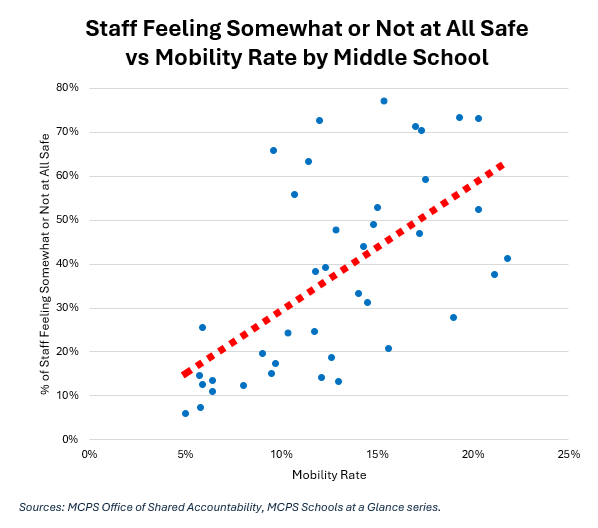
The line of best fit slopes upward, indicating a positive relationship between these two variables. The correlation coefficient of the two is +0.61, showing a moderate positive correlation.
Now let’s look at high schools. The scatter chart below shows the percentage of staff who feel somewhat or not at all safe (vertical axis) and the percentage of students who receive free and reduced price meals (FARMs rate, horizontal axis) for high schools.
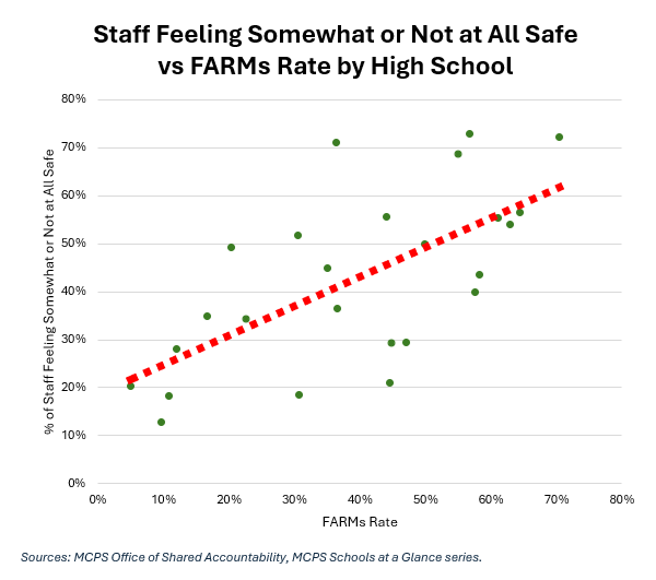
The correlation coefficient of these two variables is +0.66, a moderate positive correlation.
The scatter chart below shows the percentage of staff who feel somewhat or not at all safe (vertical axis) and the percentage of students who are Black for high schools.
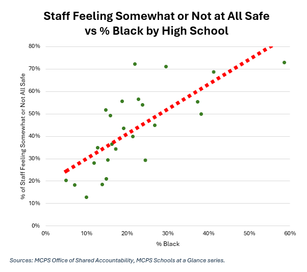
The correlation coefficient of these two variables is +0.73, a strong positive correlation.
Here is one last chart. The scatter chart below shows the percentage of staff who feel somewhat or not at all safe (vertical axis) and the percentage of students who are White for high schools.
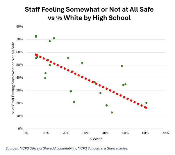
The line of best fit slopes downward, indicating a negative relationship between these two variables. The correlation coefficient of the two is -0.70, showing a strong negative correlation.
As with the student data shown in Part Five, the staff data contains correlations between economic and racial data and feelings of safety. Correlations are not the same as causation, but these relationships imply patterns in safety in MCPS. We will wrap up in our conclusion.