By Adam Pagnucco.
In Parts Four and Five, we examined contributions to publicly financed candidates by region. Today, let’s look at local areas as defined here.
The pie chart below shows the distribution of in-county individual contributions to publicly financed candidates.
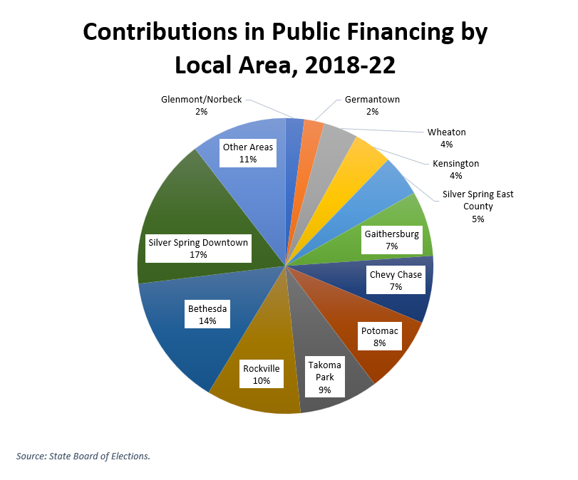
The areas shown are all among the most populated areas in the county, so of course they will show up as big contributors here. What’s really interesting is what happens when they are adjusted by population. The chart below shows per capita contributions for every local area in the county with at least 10,000 residents. We also threw in Boyds and Leisure World, which have close to that number.
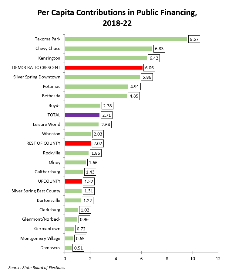
Now we see how thoroughly the Democratic Crescent (Downcounty) dominates public financing. In per capita terms, five of the top six contributing jurisdictions are in or near the Beltway, with Potomac as the sole exception. Many other areas to the north and east lag badly.
As you might expect, this geographic distribution has strong implications for the demographics of contributions. We will examine that next.