By Adam Pagnucco.
In Part Three, we learned that rising average wages during the pandemic are likely a sign of growing income inequality as job losses are concentrated in lower paying positions. Preliminary data from the U.S. Bureau of Labor Statistics (BLS) suggests how this is playing out across Maryland.
BLS’s county employment series has a six-month lag in release time. As of this writing, county-level data are only available through the second quarter of 2020. However, BLS also has a state and metro area series that is more up to date. Preliminary data for that series is currently available through the end of 2020. BLS releases that data for metropolitan statistical areas in Maryland defined as follows:
Baltimore-Columbia-Towson: Anne Arundel, Baltimore City, Baltimore County, Carroll, Harford, Howard and Queen Anne’s counties.
California-Lexington Park: St. Mary’s County.
Cumberland: Allegany County in Maryland and Mineral County in West Virginia.
Hagerstown-Martinsburg: Washington County in Maryland and Berkeley and Morgan counties in West Virginia.
Silver Spring-Frederick-Rockville: Frederick and Montgomery counties.
Baltimore City
Calvert-Charles-Prince George’s
The chart below shows nonfarm employment declines by Maryland metro area in 2020.
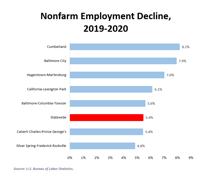
According to the state’s wealth measures, Allegany County, Washington County and Baltimore City, which had some of the largest job losses, are three of the least wealthy jurisdictions in Maryland. The Silver Spring-Frederick-Rockville metro area, which had one of the smallest job losses, is dominated by Montgomery County, one of the wealthiest jurisdictions in Maryland. This chart, while admittedly incomplete, hints at widening geographic inequality between different parts of the state.
The chart below shows change in average hourly earnings by Maryland metro area in 2020.
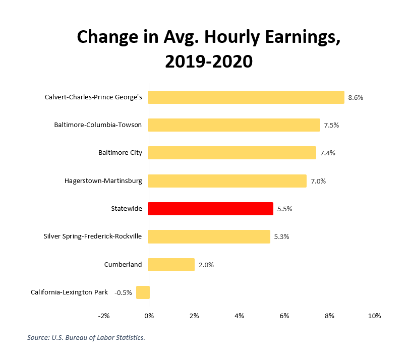
California-Lexington Park (St. Mary’s County) is the only metro area here showing a drop in average hourly earnings. All the other areas show an increase exceeding the 1.4% rise in the national consumer price index last year. Remember what we learned in Part Three: because low-wage workers have likely been disproportionately affected by the COVID recession, a rising average wage is probably a sign of rising income inequality. This chart, while also incomplete, hints at rising inequality inside many local jurisdictions in the state.
There is a silver lining for state and local budgets here: low income workers pay lower absolute amounts of property and income taxes than higher income workers. To the extent that the recession’s impact falls disproportionately on the lower end of the income distribution, budget losses may turn out to be less than initially feared. But that’s cold comfort to those who have been let go from payroll jobs and have turned to the gig economy to survive. Governments that benefit from less-than-expected budget pain have a responsibility to help these people until the economy revives.