By Adam Pagnucco.
Any analysis of election results must start with turnout. Who voted? If you know that, then you have a head start on deciphering who won – and why.
In Montgomery County, the Democratic primary usually reigns supreme, at least in recent years. No state legislative or council district in the county has elected a Republican in a partisan contest since 2002 and the last Republican to serve as county executive left office in 1978. (Predictably, he was tired of the county government’s tendency for “paralysis by analysis,” which was ingrained even then!) The exception to this principle pertains to ballot questions, which are decided in the general election and therefore are subject to votes by non-Democrats. But ballot questions – as fun as they can be – are a topic for another day while we look at the Dem primary.
Let’s start with Democratic turnout by state legislative district and council district. State districts appear in red and council districts appear in blue. One state district (9A) is shared with Howard County. Only the MoCo portion’s turnout is shown.
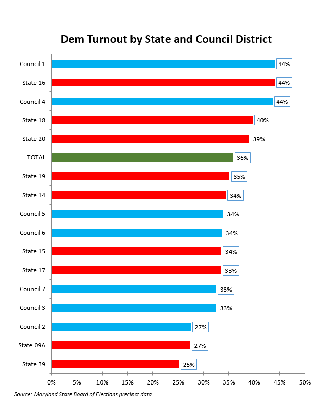
Many readers have been involved in state and county politics longer than me and I bet exactly zero of them are surprised by the above chart. The highest turnout districts – council districts 1 and 4 and state districts 16, 18 and 20 – have areas with fanatical Dems in them like Bethesda, Chevy Chase, Kensington, Takoma Park and inside-the-Beltway Silver Spring. The lowest turnout districts are in the northern reaches of the county.
Now let’s look at turnout by region and local area. (See my methodology post for definitions.)
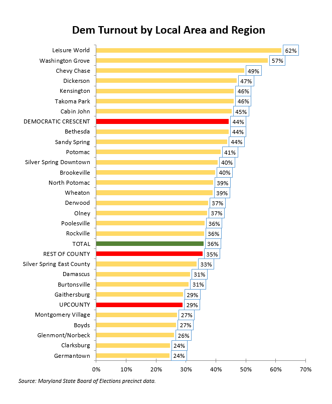
Once again, there are no surprises. Dark blue Downcounty areas like Chevy Chase, Kensington, Takoma Park and Bethesda, along with Leisure World, have been leading county turnout forever. Upcounty communities like Germantown and Clarksburg have lagged just as long. Marilyn Balcombe, who will be joining the county council from an Upcounty district this winter, complained about Upcounty’s low turnout two years ago and she was right.
Lastly, the chart below takes a stab at approximating turnout patterns by race. As I detailed on my definition post, I used census redistricting data to identify the 25 precincts with the greatest concentrations of Asian, Black, Latino and White adult populations. Here are turnout rates for each of those sets of precincts.
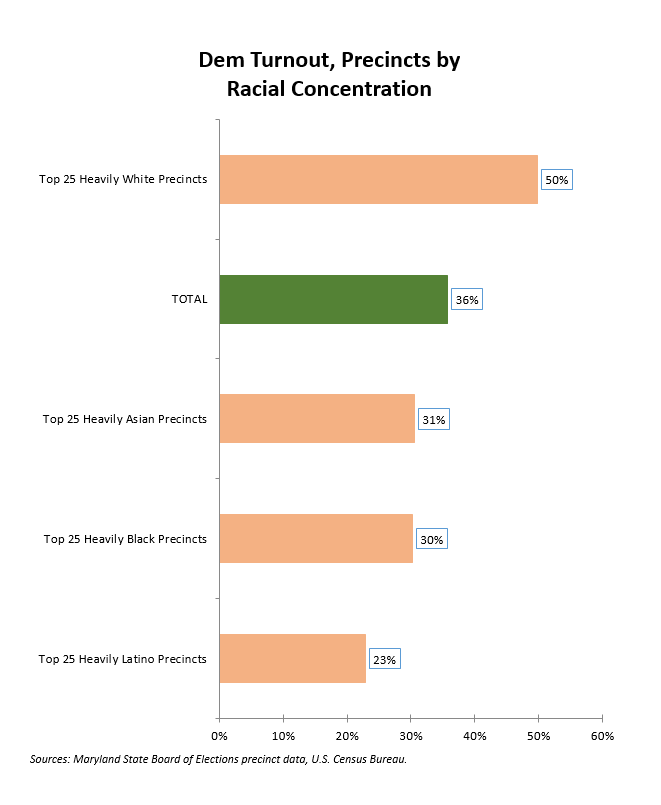
While the above data is an imperfect proxy, it’s obvious that there is a racial turnout gap, especially with regards to Latino voters. Black and brown communities must increase their turnout to build their political power in MoCo.
That’s not all. While there are differences between communities in turnout rate, there are also some differences in how they cast their votes. More to come in Part Two!