
By Adam Pagnucco.
Part One examined long-term trends in registration and gubernatorial primary turnout rate by party. Part Two looked at the geography of Democratic turnout in this year’s primary. Part Three began examining race and included charts on Dem turnout rate by Asian and Black precinct population percentage. Let’s continue.
The chart below shows Dem turnout rates for four groups of precincts, each within a different range of Latino population percentage. I selected the cutoff percentages to make each of these four groups roughly comparable in size.
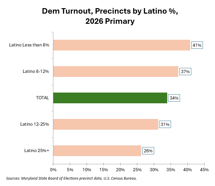
There is a significant negative relationship between Dem turnout and Latino population percentage. Precincts that are less than 8% Latino have a far higher turnout rate (41%) than precincts that are 25% or more Latino (26%).
The chart below shows the same information for four groups of precincts by White population percentage.
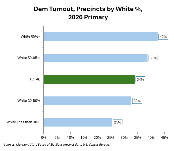
Rising White percentage is associated with rising turnout. This is a mirror image of the Latino chart. Data like this makes me wonder if despite its status as a majority-minority county, MoCo’s regular Dem voters may in fact be majority White.
Finally, I took a quick and dirty stab at income’s relationship with voting. I obtained the mean household income from the U.S. Census Bureau’s 2020-24 American Community Survey for each precinct’s zip code and calculated Dem turnouts for four income groups. The chart below shows the result.
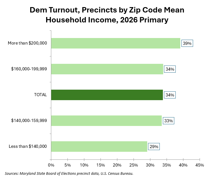
While turnout tends to rise with income, the effect is not as large as the chart showing White population ranges above.
We will have more in Part Five.