
By Adam Pagnucco.
Part One examined long-term trends in registration and gubernatorial primary turnout rate by party. Part Two looked at the geography of Democratic turnout in this year’s primary. Part Three began examining race and included charts on Dem turnout rate by Asian and Black precinct population percentage. Part Four looked at charts on Dem turnout rate by Latino and White precinct population as well as mean zip code household income. Today, let’s use correlation coefficients to further understand these variables.
A correlation coefficient is a simple statistic that measures the relationship between two variables. A correlation of +1.0 is a perfect positive relationship between the two while a correlation of -1.0 is a perfect negative relationship. There is disagreement about characterizing the strength of the correlation, but for this analysis, I will regard anything outside of +/- 0.5 as moderate to strong and worthy of mention.
One thing that makes interpreting correlation coefficients tricky is that an association between two variables does not prove that one causes the other. Cause could arise from one or more outside variables that together influence the two being examined. Sample problems could also affect the calculation. So while a strong correlation coefficient provides a bit of evidence for two variables being associated in some way, it’s still worth a bit of investigation to firm it up.
Statistical caveats aside, I calculated the following correlation coefficients between precinct turnout rate and the following variables:
White percentage of adult population: +0.74
Mean household income of zip code: +0.33
Asian percentage of adult population: -0.30
Black percentage of adult population: -0.43
Latino percentage of adult population: -0.57
The only two relationships among these that appear significant are the ones including White and Latino percentages of population. The scatter chart below plots each precinct’s turnout rate (vertical axis) and Latino population percentage (horizontal axis).
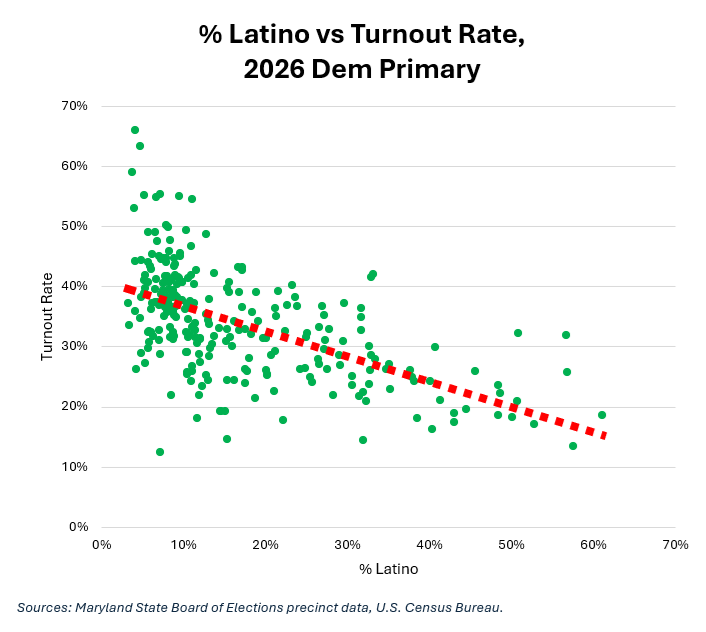
See the red dashed line? That’s the line of best fit, and it indicates the negative relationship between the two variables. As we saw in Part Four, heavily Latino precincts tend to have lower turnout rates.
The scatter chart below plots each precinct’s turnout rate (vertical axis) and White population percentage (horizontal axis).
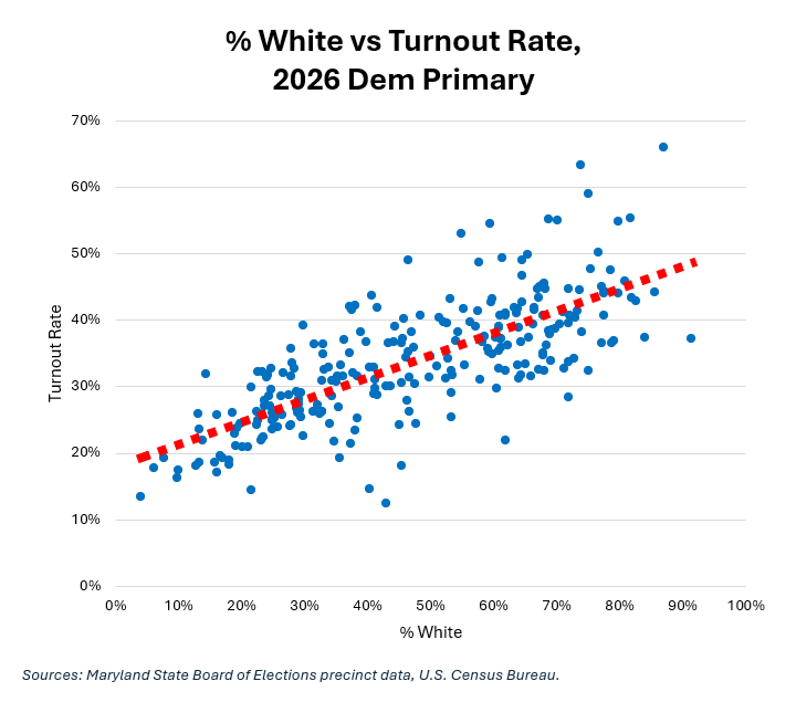
This time, the line of best fit (the red dashed line) slopes upwards, indicating a positive relationship. Again, as we saw in Part Four, heavily White precincts tend to have higher turnout rates.
There is one variable that trumps all of the other ones mentioned above: past turnout. The scatter chart below plots each precinct’s 2026 Dem primary turnout rate (vertical axis) and 2022 Dem primary turnout rate (horizontal axis).
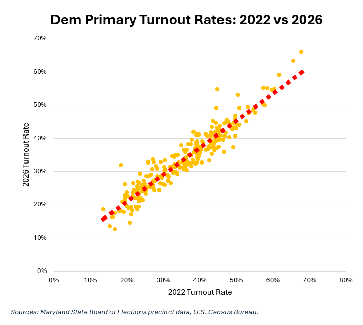
Not only does the line of best fit slope upwards but the dots are closely clustered around it. The correlation coefficient between 2022 turnout and 2026 turnout is +0.94. That’s close to perfect.
So here’s the lesson for candidates, campaign managers and field directors. If you want to reach voters who actually vote, target the precincts with high turnout rates. If they voted heavily last time, they are likely to vote heavily next time.
Another lesson is that for all of MoCo’s diversity, White voters constitute a disproportionate number of Dem primary voters. In fact, I wouldn’t be surprised if they were a majority. Advocates for Black and Brown communities must concentrate on boosting their turnout rates if they want to build more political power in MoCo.
We will conclude with voting modes next.