
By Adam Pagnucco.
Part One listed Will Jawando’s assets and liabilities. Part Two looked at Andrew Friedson. Part Three examined Evan Glass. Part Four recited a timeline of key events in the election cycle. Parts Five and Six broke down Jawando’s performance. Part Seven began looking at Friedson’s performance.
This section makes use of correlation coefficients to examine factors associated with Friedson’s precinct performance. Here is how I explained this statistic in a prior post.
*****
A correlation coefficient is a simple statistic that measures the relationship between two variables. A correlation of +1.0 is a perfect positive relationship between the two while a correlation of -1.0 is a perfect negative relationship. There is disagreement about characterizing the strength of the correlation, but for this analysis, I will regard anything outside of +/- 0.5 as moderate to strong and worthy of mention.
One thing that makes interpreting correlation coefficients tricky is that an association between two variables does not prove that one causes the other. Cause could arise from one or more outside variables that together influence the two being examined. Sample problems could also affect the calculation. So while a strong correlation coefficient provides a bit of evidence for two variables being associated in some way, it’s still worth a bit of investigation to firm it up.
*****
Friedson’s results by district, area and racial concentration, as profiled in Part Seven, provide clues to his strengths and weaknesses. Now we will use correlation coefficients and scatter charts to zero in on factors we could measure that were associated with his performance for better or worse.
The following five factors stood out.
Positive: David Blair’s Performance in 2022
The scatter chart below shows Friedson’s precinct vote percentage (horizontal axis) plotted against county executive candidate David Blair’s vote percentage in 2022 (vertical axis) for each of the county’s 257 precincts.
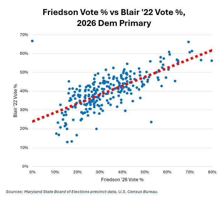
The upward sloping line of best fit (red dashes) indicates a positive relationship. The correlation coefficient was +0.70, a strong result. This shows that Friedson’s results, both good and bad, resembled Blair’s. This is no surprise considering the similarity in their appeal (and I worked for Blair in 2022).
Conversely, the correlation coefficient between Friedson’s performance and the 2022 performance of Blair’s chief rival, Marc Elrich, was -0.54. That makes sense: if Friedson did best where Blair did best, then he also did best where Elrich did worst and vice versa.
Negative: Black Population Percentage of Precinct
The scatter chart below shows Friedson’s precinct vote percentage (horizontal axis) plotted against Black population percentage (vertical axis).
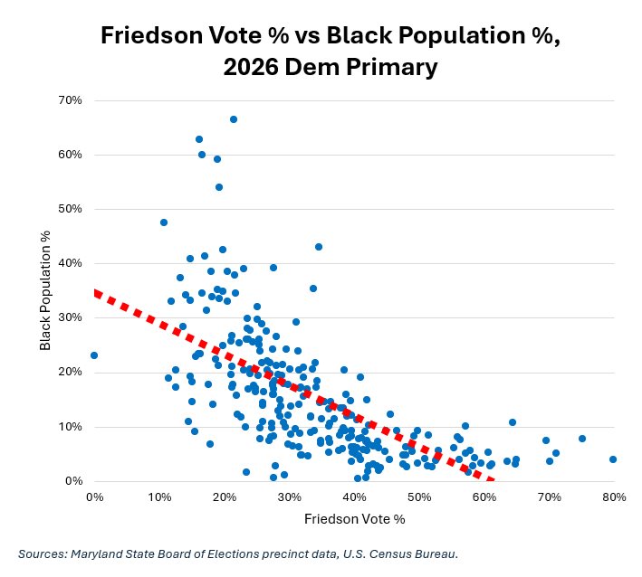
The downward sloping line of best fit (in red dashes) indicates a negative relationship. The correlation coefficient was -0.64, a moderate-to-strong result. Heavily Black precincts favored Jawando and proved to be a detriment for Friedson.
Positive: Mean Zip Code Household Income
The scatter chart below shows Friedson’s precinct vote percentage (horizontal axis) plotted against mean zip code household income (vertical axis).
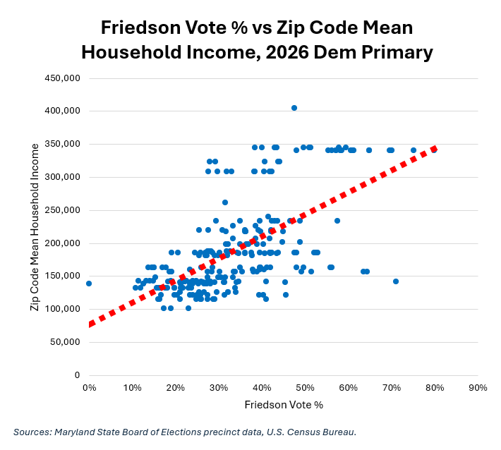
The upward sloping line of best fit (red dashes) indicates a positive relationship. The correlation coefficient was +0.64, a moderate-to-strong result. One reason why Friedson did better in upper-income precincts is that his council district is full of them. Jawando won precincts in lower-income communities (like Montgomery Village and Glenmont/Norbeck).
Positive: White Population Percentage of Precinct
The scatter chart below shows Friedson’s precinct vote percentage (horizontal axis) plotted against White population percentage (vertical axis).
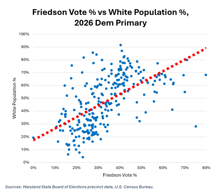
The upward sloping line of best fit (red dashes) indicates a positive relationship. The correlation coefficient was +0.59, a moderate-to-strong result. Again, part of the reason for this relationship is that Friedson’s council district contains a concentration of White voters.
Negative: Latino Population Percentage of Precinct
The scatter chart below shows Friedson’s precinct vote percentage (horizontal axis) plotted against Latino population percentage (vertical axis).
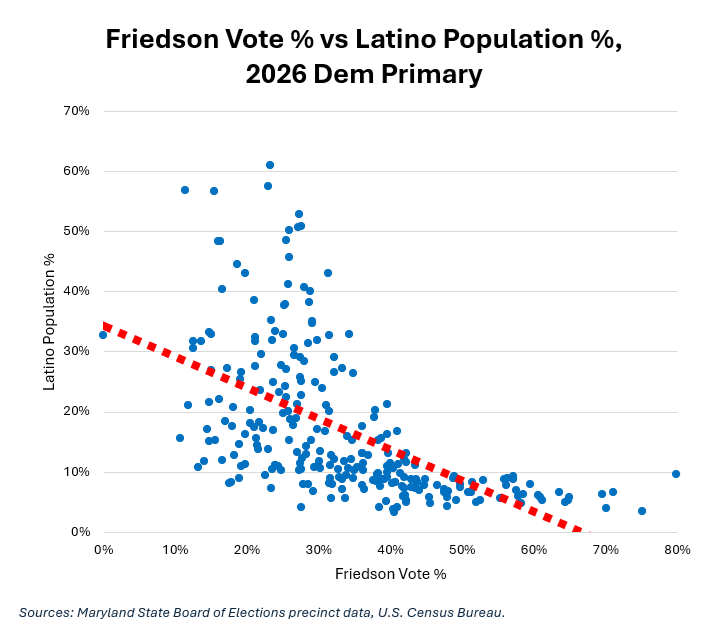
The downward sloping line of best fit (in red dashes) indicates a negative relationship. The correlation coefficient was -0.56, a moderate-to-strong result. Jawando did much better in heavily Latino precincts than Friedson, winning in Wheaton, Glenmont/Norbeck and Montgomery Village.
Friedson’s coalition included White voters, upper-income people, Blair supporters and many Jews in addition to those attracted to his ideological appeal (low taxes and pro-growth). The correlation coefficient between Friedson’s precinct performance and Jawando’s is a powerful -0.89, indicating that the two were direct rivals. Overall, these results suggest that Friedson reassembled much of the Blair base, but did not have Blair’s money or name recognition from running countywide in a prior race to match the latter’s 2022 performance.
Next: Evan Glass.